Ranking MLB jerseys
One of my favorite aspects of baseball is team jerseys. Each Jersey is unique in its own way, whether it has to do with the design, the color scheme, or the creativity. Throughout time, teams have modernized or rebranded their uniforms. For example, in the 1980s, having the same-colored jersey and pants was common. Today, most teams keep their pants white or grey and keep the jersey colored. For this list, I have taken my favorite jersey from every MLB team. I will be ranking them from worst to best.
#30: Detroit Tigers Road Grey
This is the only road jersey that will be on this list. The Detroit Tigers have only two jerseys to choose from. Their home jersey with the Old English D is a classic, but overall, it’s just boring. The Road jersey isn’t much better but includes more color. The jersey includes a Blue “Detroit” across the chest with an Orange outline. It may not be that much, but it gets the job done, at least.
#29: Arizona Diamondbacks Red Alternate
The Arizona Diamondbacks rebranded their uniforms in 2016. I did not like them at all. The jerseys included snakeskin on the shoulders, which were interesting, but they just didn’t work. Thankfully, it was removed in 2020. My favorite jersey for the Diamondbacks has to be their Red Alternates. The reason that this jersey is this low on the list is because of the design. I just don’t like the font. I think the best thing that the Dbacks can do is to go back to the Purple and Teal design from the 1990s. They wear them on Thursday home games, but those jerseys were amazing. They should bring them back permanently.
#28: Miami Marlins Home White
The Miami Marlins have had three different uniform brands since they entered the league in 1993. Their most recent rebrand was for the 2019 season. I’d say that their current jerseys are their second-best concept just behind the jerseys they used from 1993-2011. The jersey includes a Black “Miami” across the chest with a Blue and Red outline. I’d say it gets the job done, but there’s nothing that special about it. If their Light Blue Spring Training Jersey was used in the regular season, then It’d probably be on this list, and it would rank higher than 28. Ultimately, I think that the Marlins should either go back to the jerseys that they used from when they were the “Florida Marlins,” or they should try a “Vice City” concept like the Miami Heat are doing.
#27: Texas Rangers Blue Alternate
The Texas Rangers have a variety of jerseys to choose from, but I’d say their best one is their Royal Blue Alternate. The color scheme works great. I think the Red outline on the White “Texas” stands out really well, but the jersey just isn’t as great as others. It’s just your basic-colored jersey. However, I think the Rangers should stay with their current design because I think that they’re fine about where they’re at. I don’t think that a change is needed.
#26: Cincinnati Reds Home White
If the Cincinnati Reds had not changed their Red Alternate Jersey in 2020, then they would be a lot higher on this list. I do not like the fact that they completely changed the font of that jersey. Therefore, I’d say that their best choice here is the standard home whites. It’s a simple and classic jersey with the team logo placed over the heart. It also includes Red striping down the middle. I also really like the font the Reds use for the players’ names and numbers. I’d say it really fits the atmosphere of Cincinnati.
#25: Los Angeles Angels Red Alternate
I wish I could put this one higher on the list, but I just can’t. This is without a doubt, the best jersey that the Los Angeles Angels have to offer. However, just like the Rangers, it’s just your basic road jersey. I have always been a fan of the Halo around the A, but the rest of the letters across the chest just doesn’t do it for me. It’s also ironic that the team called the “Angels” wears the color Red, which represents the complete opposite of the term. Just saying.
#24: San Francisco Giants Home White
I have never been a fan of the Giants’ jerseys for some reason, but I’d say their best ones are the home whites. It’s a classic jersey, it includes some Orange, but I don’t really find anything special in it. Their alternate jerseys are pretty much bland. The only reason why I have the Giants jersey this high on the list is because of the history of the jersey. Yes, it’s a classic, but the overall design just does not fit.
#23: Colorado Rockies Purple Alternate
If it were 2017, this jersey would be near the top of the list, but for some reason, the jersey has just grown on me. I like the concept of a Purple Jersey, but the Rockies failed at making it interesting. Honestly, The Rockies uniforms are just boring and have little to offer. It’s unfortunate because Purple and Black is such a great color scheme, especially for a baseball team. I wish they could use Purple more often on their other jerseys.
#22: Minnesota Twins Road Navy Blue Alternate
The Twins have two Navy Blue jerseys, and the road version is definitely better. The Home jersey that was introduced in 2019, had a different font and added some Gold to the jersey. To be honest, I don’t care for the Gold, and that’s why I think that the road jersey looks better. I really like the font of the “Minnesota” across the chest. I think the Red stands out very well. However, just like other jerseys this low on the list, there isn’t anything that special about it.
#21: Seattle Mariners Teal Alternate
The Seattle Mariners wear these jerseys on Friday home games. It really fits Seattle’s “Blue-Green” color scheme. Whenever I think of these jerseys, I think of Ken Griffey Jr, who is one of my favorite players of all time. The Teal is different than usual, but it’s interesting, and it works well.
#20: Washinton Nationals Red Alternate
This is another jersey that would’ve been at the top of my list three years ago, but over time, it hasn’t aged well. I still really like the jersey, and I wish the Nationals would use it more. Recently, their main road uniform has been a Navy-Blue Jersey with “Nationals” across the chest. It seems that they will do the same with their home whites. I’m not so happy about the Nationals using the “Curly W” jerseys less often. Yes, I know the W looks exactly like the Walgreens logo, but I like the concept better. When I think of the Washington Nationals, I see them in Red, not Blue.
#19: New York Yankees Home White
The most popular jersey in all sports! Why is it this low? Yes, it’s a classic, but just like the Giants and the Tigers, it’s just boring. The “NY” logo on the heart is the most recognizable logo in all sports. You can see people in Europe wearing a Yankees hat and they’ll have no idea that they’re a baseball team. The pinstripes will always be a classic, but it’s 2021. The Yankees need to bring some more color into their uniforms. They need a Navy Blue Alternate.
#18: Kansas City Royals Light Blue Alternate
The Kansas City Royals quickly became one of the worst teams in baseball right after winning the World Series in 2015. I have always liked their jerseys, especially the Light Blue Alternate, which is worn on Sunday home games. The jersey is worn with a Royal Blue Hat. I think that the combination of Royal Blue and Light Blue is such a great color scheme, and to combine it with a sea of Blue in the bleachers? It’s a great jersey.
#17: Houston Astros Orange Alternate
Even though the Astros are one of my least favorite teams in the league, I absolutely love their uniforms, especially their Orange Alternates. No matter what stadium the Astros are playing in, they always look good in Orange. The color stands out, and you know that you’re in for a good game.
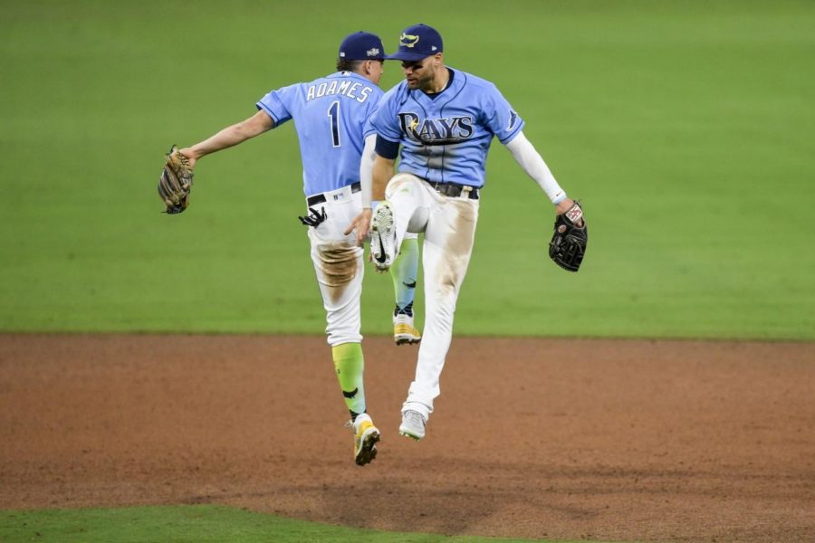
#16: Tampa Bay Rays Light Blue Alternate
The Rays wear these for Sunday home games, and they look great. They looked even better when they wore them in Game 5 of the 2020 World Series, where they played in an actual stadium. In 2018, the Rays mixed in some colors that they used when they were the Devil Rays. They improved the uniform by adding a hat with the old Devil Rays logo, and they added Blue-Green-Yellow socks, which in my opinion, are the best socks in baseball. This jersey is very similar to the Royals, but the hat and socks put them higher on the list.
#15: Cleveland Indians Red Alternate
The Indians introduced these jerseys for the 2019 season, and they are absolutely gorgeous. It’s the same design as their standard jersey, but it’s Red. This jersey used to be Navy Blue, but I think they look better in Red. However, we may not see these in the spotlight for much longer because the Indians will be changing their name after the 2021 season.
#14: Philadelphia Phillies Home White
I know these pinstripes aren’t as classic as Yankee pinstripes, but the Phillies are just better at designing them. This jersey includes more color for a pinstriped jersey. It includes mostly Red and a little bit of Blue. The jerseys remind me of the Ryan Howard and Chase Utley days during the late 2000s. The jerseys really fit the atmosphere of the city of Philadelphia.
#13: Los Angeles Dodgers Home White
Another classic jersey near the top of the list. Now, the reason why I have this jersey higher than a team like the Yankees is that it includes more color. I have always liked the “Dodger Blue” color. In fact, millions of other people have learned to like it. The Dodgers also incorporated Red into their uniform with the number under the chest. I think the color combination works great and fits the L.A. theme.
#12: Milwaukee Brewers Home Cream
I was very upset when the Brewers decided to rebrand. I had always loved their jerseys, so I was really disappointed when they changed them for the 2020 season. However, I have really adjusted to the home cream uniform, and now I think it looks great. The name and the colors of the jersey literally describe the entire state of Wisconsin. The hat with the Ball-in-Glove logo makes it even better.
#11: Boston Red Sox Home White
Another classic jersey near the top of the list. The jersey includes a color combination of Red and Navy Blue. However, what really makes this jersey stand out is the atmosphere of Fenway Park. Nine guys wearing Red playing in a stadium with Green walls is perfect.
#10: Baltimore Orioles Black Alternate
The Giants tried to match the Orioles on this, but they just couldn’t do it. The Orioles made this jersey perfectly. Their Orange jersey was a close second, but the Black one just stands out a lot more. I’ve always liked the Big Oriole font that they have across the chest. And the Orange looks perfect on a dark color such as Black.
#9: New York Mets Home Blue Alternate
The Mets use these jerseys at home games. It includes a big Orange “Mets” across the chest with a white outline. I have always loved these jerseys. The colors stand out and they remind me of their historic postseason run in 2015. However, if the Mets brought back their Black jerseys, which for some reason they stopped using in 2012, they would be on this list.
#8: Chicago White Sox Black Alternate
Just like the Orioles, the White Sox did absolutely amazing with this jersey. It looks awesome in every stadium they play in. The White “Sox” logo stands out really well, and adding a little bit of Silver to it makes it a whole lot better. Hopefully, the White Sox can be World Series contenders soon so we can see these jerseys in Prime Time more often.
#7: St. Louis Cardinals Home White
The Cardinals have the best home jersey in baseball. However, I like alternate jerseys better. The logo across the chest is very creative with two birds standing on a bat with the classic Cardinals font to go with it. The atmosphere at Busch Stadium really brings it to a whole new level.
#6: Oakland Athletics Kelly Green Alternate
In 2018, the A’s brought in a more modernized version of their Kelly-Green jerseys that they used from 1968-1981, and they did a great job bringing it back. I think it looks way better than the darker Green jerseys that they use on the Road. When the A’s get their new stadium by 2023, get me some tickets to a Friday home game where they will be rocking in these.
#5: Atlanta Braves Red Alternate
The Braves brought these jerseys back in 2019 for Friday home games and they are amazing. They are very bright and they really strengthen the atmosphere of Truist Park. I can’t wait to see these back in action for the 2021 season.
#4: Chicago Cubs Blue Alternate
Every time the Cubs are playing on the road, I’m always hoping for them to wear their Blue Alternates. Although the jersey has a very simple design, they are absolutely beautiful. The color scheme stands out in every stadium they are used in. Hopefully, the jersey will bring the Cubs luck this year as they’re going to need it.
#3: Pittsburgh Pirates Home Black Alternate
The Pirates are the worst team in baseball, but at least they have some of the best jerseys. The Pirates created a new Black Jersey for the 2020 season with “Pittsburgh” across the chest, exclusively used for road games. However, I still like the one with the “P” logo over the heart better. Thankfully, they didn’t get rid of that one, however, I wish it was still used on the road. Pittsburgh Sports Teams all have a Black and Gold color scheme, and I think the Pirates do it the best.
#2: San Diego Padres Home White
The Padres re-incorporated Brown into their logo in 2020. With it, came new jerseys. At first, I absolutely hated them, but now, here they are ranked as the second-best jersey in Baseball. The Padres are the only team to have Brown in their color scheme, and they have achieved perfection with it. The Brown Pinstripes look amazing as well as the “Padres” script across the chest. I’ll be looking forward to seeing these regularly in 2021.
#1: Toronto Blue Jays Blue Alternate
This is the best jersey in baseball. There is no other correct option. The Script, the logo under the script, the colors, are just perfect. Just like the Cubs’ Blue Alternates, they look awesome in every stadium they are used in. However, the Blue Jays overall just have a better design for this jersey. I don’t know what it is, but it just appeals to me more. I really hope these are never replaced because several teams are currently going through rebranding.
Like I have already said, jerseys are one of my favorite aspects of baseball. The colors, the design, the scripts, you name it. They are all unique and special in their own way. As the 2021 season approaches, I cannot wait to see all of them in action.
Your donation will support the student journalists of HB Plant Senior High School - Newspaper. Your contribution will allow us to purchase equipment and cover our annual website hosting costs.